


.jpg)


ALL MY PRINTS


ORDERCHAMP WORLD

The main logo for the event.
Creating the Brand Identity for Orderchamp World; a 60-Brand Cash&Carry Stand
2023 / Branding & Marketing / B2B / Cash & Carry Event
TIME FRAME
1 Week
-
June 2023
SKILLS
Mock-up
Branding
Print-Working
Animation
Marketing
TEAM
1Marketing Designer
-
Supervised by Lead
AIM
Orderchamp is an online B2B platform, but by collaborating with TICA (a huge cash&carry company in the Netherlands) Orderchamp was able to put their top brands out on display. My task was to ideate and create a new exciting brand "Orderchamp World" which would be Orderchamp's physical identity.
PURPOSE
This was all done in order to generate excitement for this new transition, to alert Orderchamp's brands of this opportunity to exhibit their products and to overall drastically increase Orderchamp's reach and exposure.
EXECUTION
In under a week I created a full brand identity guide including many online graphics, different sized posters, stickers, navigation, floor maps, flyers, and more all to ideate as many possible marketing ideas. The branding married the two brands together seamlessly in a professional fashion, were I even created a fun little animation showing this to push this campaign even further. Overall it was a huge success, and Orderchamp was able to exhibit over 60 brands and attract new retailers to the platform

A promotional advertising animation teaser for LinkedIn, Facebook and Instagram. It's fun, expresses what Orderchamp World can be about, but still adds a subtlety teasing it and adding intrigue.
%20Entree%20Banner.png)
The big 3 metre poster which was printed on the front door of TICA.

The online day-pass for the TICA warehose. This was created for interested retailers, brands and investors. In the background you can also see part of the warehouse and its scale.

First page of the brand guidelines.

The fonts and colours for the collaboration, mainly using Orderchamp fonts & colours, but also merging the colours of TICA.

A play on the possible merging of TICA x Orderchamp.

Different variations for the logo

Variations for possible online banners.

Mock-ups for different sized prints.

Additional mock-ups all to add exposure and more traffic to the area.

Giving as many options as possible to chose from.

Bottom is a standing triangle print. On the left is a quick possible 3d model to add to the table on the stall or perhaps to create it to a large scale. The right print was the many flyers for the brands that where in Orderchamp World.
ORDERCHAMP QUEST
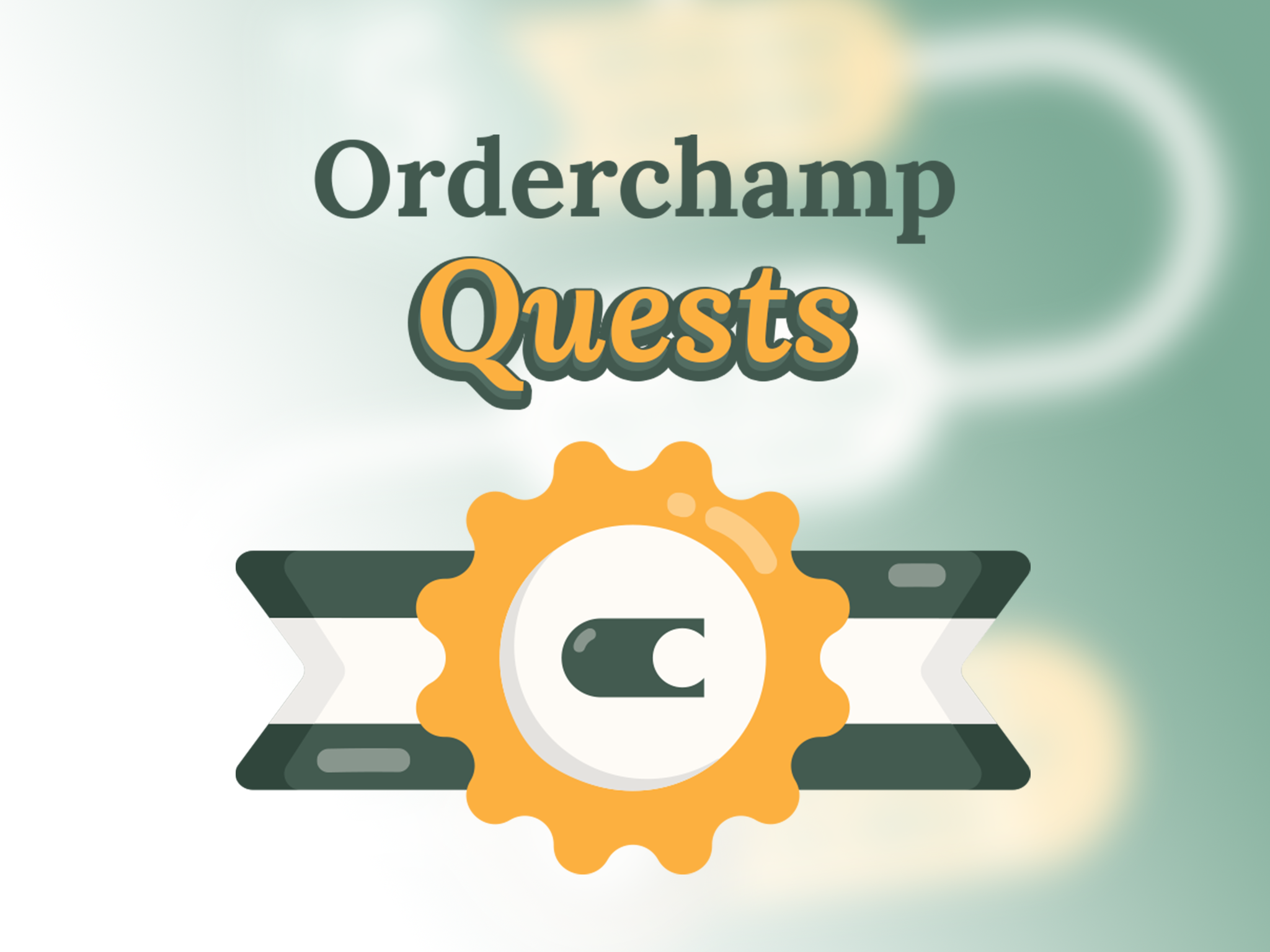
The fun logo I created for the quests, using fun, shiny round shapes and 3d text to give it a game-feeling while still remaining on-brand with the brand colours.
Concept Development for a Website Gamification Project
2023 / Branding & Marketing / B2B / Gamification Project
TIME FRAME
3 Weeks
-
June 2022
SKILLS
UX
Branding
Animation
Marketing
Ideation
TEAM
1 Graphic Designer
2 Web Builders
AIM
The aim of Orderchamp Quests started as a big ideation session trying to come up with ideas to apply gamification to the B2B website in order to possibly increase retention, excitement and overall push the brand further into something unique. Some ideas included a prize system and a wheel of fortune, but in the end the idea of "quests" was chosen.
PURPOSE
Orderchamp Quest gives you weekly quests from browsing the webpage to buying products, where upon completion the user is given shiny achievements that have real-world value. This enhances the experience of navigating the webpage and gives incentive to many tasks around the website which can benefit retailers (such as discounts).
EXECUTION
I was part of this project from the very beginning and after ideation I was solely tasked in giving this idea a brand identity from scratch. It had to be playful yet professional, as well as personal, satisfying and on-brand. I created approachable satisfying icons, a playful logo, as well as animated GIFs, creating a mini-world for thousands of retailers to see. I showed my process to my two email specialist co-workers who where going to start this project through email, and made modifications to suit the email ecosystem. In the end, we were able to improve website retention and increase the customer’s exposure to brands and events whilst also creating a more fun, personal, and inviting environment to a B2B platform.

A fun animation showing the logo in action - adding to the game-feel of the whole campaign. The colours are on-brand and look professional and fun, where the increase in saturation to the yellow makes it look like gold. This alongside the shape looking like a medal all goes in theme with the concept of achievements. The "gear-like" center makes it fun to animate and also acts as a unique shape that goes hand-in-hand with the themes of the campaign.

A fun visual for an infographic overlaying how the quest system works, in order for users to familiarize themselves with the system.

My ideations for the possible logos. We liked the ribbon as it conveyed the message quite well. In the end the logo was chosen due to its unique shape and incorporation of the logo.

The first week's quests and rewards alongside some useful assets to use. This visual style utilized shiny, round icons to convey approachability and to make it feel rewarding, while also remaining professional.

The test run for Orderchamp Quests!
WEBREADER
Above shows the first stage refined prototype used for building the solution further.
Project Proposal for an Informative yet Accessible Internet-led Service Promoting Interests in the Elderly
2021-22 / Thesis Project / Project Proposal / Accessibility & Technology
TIME FRAME
October 2021
-
January 2022
SKILLS
Prototyping
Wireframing
Concept Development
Primary Research
Business Knowledge
Branding
TEAM
Individual
-
Thesis Project
AIM
To create a filter for the internet; a device that makes it easier to find the interests you want to explore on the web, and easier to organize the information you find (focusing exclusively on the elderly population).
PURPOSE
To allow for the exploration of hobbies in the elderly in an enjoyable fashion; seeking the benefits of the internet by also removing the wall of overwhelming information and high learning curve that comes with it.
BRAND VALUES
1. Customer accessibility and needs are a priority
2. To make sure to adhere to customer’s needs throughout
3. To reduce the skepticism, negative light of the internet and demotivation that comes from lack of accessibility with the internet
4. To promote activity and importance to one’s interests

Throughout my thesis, I explore the capabilities of the internet for the elderly in terms of hobbies and interests, alongside its potential positive effects on mental and physical health. I explored this using very intimate research methods (co-design sessions), to create a product that was truly accessible. On the top is a graphic showing Lidia’s (one of my co-design participants) use of social media; what groups she surrounds herself with and how she interacts with social media in an indirect fashion most times.

I interpreted all the primary data and created an application alongside my co-design participants; sketching to then wireframing (top) a phone launcher with a custom search filtering feature. Having the demographic alongside the design process is key for creating an accessible product, and should be applied more in design research.

Once the wireframing was complete, I refined the prototypes into a coherent polished design. The prototypes show the main page, contacts page, as well as the search bar with the simplified internet browsing idea (even including talking groups as this was some feedback I was given by the users). The overall aesthetic had to remain very simple and be accessible to many kinds of visual disabilities, although a theme editor function could be added later.


I went more in depth into the business aspect of it, following the business model canvas (BMC) for a robust product proposal. I also created a brand identity and a potential google play store page. The project would be funded by a charity/kickstarter for R&D, were the extra funds would go into maintaining the domain/website upkeep and hopefully any Ads and the pricing of the app would keep it running indefinitely.
SOCIAL DIGITAL
FUNDRAVER
Stamps used for the event.
A "Fundraver" at Dundee's Kings Underground Techno Club
2022 / Branding / Event Creation / Nightclub
TIME FRAME
3 Weeks
-
April 2022
SKILLS
Marketing
Branding
Team Work
Video Editing
TEAM
1 Treasurer
1 Designer (Me)
1 Markete
As the lead branding designer for this event I was in charge of all branding, animation and social posts to give this huge event a face. The branding had to be exciting and eye-catching in order to get as many people excited as possible. We contacted people to get a high-fi system, managed to get a solid lineup of DJs, created an event page, printed hundreds of posters around town, and I had fun creating all of the countless graphics for various promotional purposes. In the end we had a huge turn-up and overall it was a huge success.

The "Hero Image" for our event which we used as a banner for the event pages in Facebook, King's website, and RA.co

One ticket for the event which was given digitally for those who pre-ordered the tickets, all to build on the brand and excitement.

Promotional online graphics for Facebook and Instagram, generating more tractions through fun activities and deals.

The event page on RA.co

Additional promotional graphics.
HEARMEOUT
Above shows a student using the application; chatting and working with their classmates in an interactive environment.
Creating a Reliable, Approachable, and Interactive Platform to Help Bridge the Communicational Divide between Students and Teachers.
2021 / Speculative Project / Product Research & Development / Teaching
TIME FRAME
2 Weeks
-
March 2021
SKILLS
UI/UX
Prototyping
Wireframing
Primary Research
Systems Thinking
TEAM
Individual
-
Pressure Project
PROBLEM
Everything is online and working collaboratively has us juggling a variety of programs at once. In class, helping each other, going into groups, forming discussions and relationships with one another and with the teacher; all these things have been made difficult in recent times, and students can often times feel isolated with the rest of the class, especially after class. By interviewing students in secondary and higher education, and analyzing video conferencing and interactive applications, I found a necessity for a platform to connect students and teachers.
SOLUTION
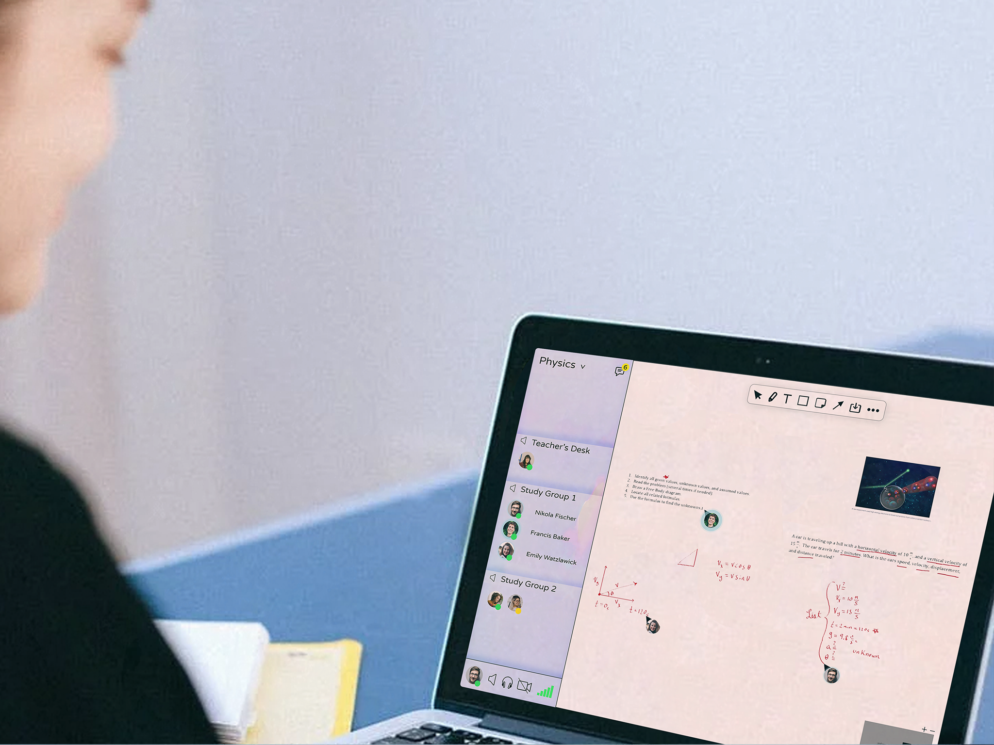
Creating a reliable, approachable, and interactive platform for discussions, collaborations, and mutual help between students. Channels are open for everyone in the class to join at any time, and the activity of each user can be seen across the interactive boards. Teachers can sit on a channel, emulating a teacher’s desk, and students can jump in and out as they please. Help each other, work with each other, talk to each other.

This is part of my vast primary research I undertook to finally come up with the first prototypes.

The Homepage

This shows all the elements outside the interactive board within the application, including the chat, feedback, files and the board activity (showing you who is where)
PERSONAL TIME
This is the full explanation of the project, the animation and video was edited by myself.
A Speculative Project Tackling our Subjective Perceptions and Relationships with Time
2021 / Speculative Project / Concept Development / Subjectivity of Time
TIME FRAME
2 Weeks
-
May 2021
SKILLS
Animation
Wireframing
Primary Research
UI/UX
WatchOS
TEAM
Mat & Fin
-
2 Interaction Designers
AIM
We wanted to create an Apple Watch app that prompts the wearer to reflect on their personal and social relationship with time. We want to highlight the personalization of time through a simple & meaningful interaction.
DESIGN PROCESS
We used both cultural probes and co-design sessions. The aim of this insight gathering method is to develop the prototype with communal idea generation, exploring our subjective relationship with time while closely including the demographic; giving the users tools to create amongst other thought-provoking activities. This gives insight on what the users really feel, rather than what they would usually say in an interview setting. These two insight methods are valuable and with them all the motivators and depths of the demographic can be explored to later create a successful product.
COMPLICATIONS
Personal Time adopts the Human Interface Guidelines principles and is mostly interacted with through complications. A total of 7 different complications were designed to allow the user to choose between different sizes and styles to suit their favourite watch face & personal style. Each complication style suited at least 1 complication variation, resulting in 16 total complications. Personal Time’s colour scheme matches the watch face’s ‘global’ colour – this means that the colour for the Personal Time complications changes to the watch face colour. Otherwise it remains white - this is to show that the Personal Time could be as relevant to the wearer as conventional time.

The full application broken down in a clear wireframe-style graphic. It shows the customizability, the toggles for the data collected, alongside more information.
A hand showing the device in use in full-screen uninterupted mode.

The user once again using the product, more clearly showing the personalized time.

This is a potential journey showing the app in use over time.
MUSIC MEMORY
MACHINE

(Left) Zack's Protoype, (Middle) Final Logo, (Right) Personalized Product Cards for the Clients
An Exploration into our Nostalgic Associations with Music and its Potential to Develop both Storytelling and Intrapersonal Relationships
2021-22 / Honours Project / Project Development / Music & Nostalgia
TIME FRAME
September 2021
-
March 2022
SKILLS
Prototyping
Wood-working
Concept Development
Primary Research
Ethnographic Research
Branding
TEAM
Individual
-
Honours Project
Music itself is an emotional medium, but our experiences and associations that we gather throughout our lives can transform the same music into something uniquely special. Be it a song from our child-hood, a heartbreak, or a journey of self-exploration, these can all instantly flood in emotions and memories from a very specific point in time.
My work throughout these months explored this particular relationship with music, and more specifically how it can form connectedness between people by encapsulating a specific memory and serve as a catalyst for storytelling.
The final product was part service, part product; a device that the user would use over time to collect these memories, all in a way that made sense to that particular person. I wanted it to be incredibly personalized, where the experience of choosing the materials, creating the device, receiving it, and using it throughout their lives would be something that in of itself would be a treasured experience.
In the end, as memories are gathered into this personalized machine, the individual can choose whether it be a completely personal experience, or something they might want to share with someone they hold dear in their lives.
Read the whole story! (23MB)
BOOKLET (Spread) - MATIAS BONANATA_2021_22.pdf
My first cultural probe that I did. It was created to gauge how connected people actually were to music, by giving them an engaging activity. It was three distinct songs from different time periods and the activity had different prompts such as if it evoked a memory or feeling. At the end they wrote they got to write a song which spoke to them. This was one of three probes which I gave to people.

From my initial insights I realized the connection between memories and music where sometimes quite prevalent in some individuals. From this I also found how time is an important factor in cultivating our relationship with songs. Because of this I made this graphic based on 5 songs I've been listening to for years and how my relationship with them changed over time.

This is my plan for Zack's Music Memory Machine. After going through his interests, what textures he liked best, what interactivities he preferred, and his relationship with music, I created a personalized machine built on all of these insights.
This is Zack's initial MK1 working prototype sent specifically to him alongside a cute personalized card. The idea would be to build a personal relationship with clients and create a long-lasting product that they would keep as a sort of treasure and come back to every so often for various years of their life. The journey from ideation to creation of this product is done incredibly personalized and close with the client.

This is the music memory suitcase that would be brought in to the first meeting. The person creating the product (left) would come and consult the client (right) and ask them questions about their interests, music, memories, and then let them choose what texture and interactive inputs spoke to them the most. Then the person creating the product would take these insights and start creating the personalized music machine for the client.

The journey can be seen above in this comic. From first consultation to finalised product. Every product is different and incredibly personalised.

As part of the branding for the project I used advertisements inspired from this different eras, as this project strongly had to do with memories and the past.

Yet another playful advert I created, adding to the approachable, fun brand that is Music Memory Machine.
TRANSPARENCY
GOGGLES
The transparency goggles in use at a supermarket, showing the ethical (green) and unethical (red) companies.
2035: The Goggles that Lets you See the Real Transparency
2020 / Speculative Project / Concept Development / Sustainability
TIME FRAME
1 Week
-
May 2020
SKILLS
Sustainability
Branding
Future Thinking
TEAM
Individual
-
Pressure Project
As if designing for 2035, I created the "TRANSPARENCY GOGGLES: The goggles that show the real ecological truth behind food products". The aim of this project was to design a product for the year 2035, using different techniques including designing for fiction. Currently, environmental and ethical considerations vary from produce to produce, where labels are misleading and descriptions are misunderstood. "Dolphin-safe" can guarantee dolphin safety, but the ecosystems and wildlife are not inherently protected. This is one of many examples of misleading product labeling, which have extremely detrimental ecological and ethical consequences.
In the time of 2035, this issue will escalate exponentially, where we as the consumers have the power to both escalate it further or halt it. The only thing that is needed is company transparency; the transparency regarding the real ecological and ethical damage behind the produce. With full transparency, each consumer will know what products are ethically and ecologically friendly, and which ones are not. Consumers will know the real truth behind each "eco-label", and shop accordingly. Companies will have to adjust to this; creating new strategies to reduce emissions, new strategies to conserve ecosystems. Now more than ever, economical progress will be directly linked to ecological well-being. This is but an idea.
Although this would most certainly have a positive ecological impact regarding the food market, it is all speculation. This idea was more of a commentary of the world around us, and how us as shoppers have an impact on how the world operates. We should support companies that are genuinely making a positive impact on this world, not those who aren't. Make informed purchases and there will be change.

What are the transparency goggles?

The initial prototype showing more in-depth descriptions for the glasses.
DEGREE SHOW

The banner used for Facebook primarily. The branding was playing with mixed media and real-life graphics combined with bold fonts.
Creating a 60-Student Degree Show
2022 / Branding & Printing / Management / Exhibition
TIME FRAME
1 Month
-
May 2022
SKILLS
Marketing
Branding
Printing
Team Work
TEAM
5 Leads
-
30 Designers
As the lead branding & production designer for this event I was in charge of all branding, animation and social posts to give this huge event a face. The branding had to be exciting and eye-catching in order to get as many people excited as possible. We contacted people to get a high-fi system, managed to get a solid lineup of DJs, created an event page, printed hundreds of posters around town, and I had fun creating all of the countless graphics for various promotional purposes. In the end we had a huge turn-up and overall it was a huge success.

The main logo for the event playing with the theme of using photo-realistic assets, mixed media and bold glitchy text. The two twos symbolize the year and the two logos symbolize the courses. The circle-shaped logo also makes the whole text feel like it could read out 2022 as well as 202X if rearranged. The 202X is a nod to last year's graduates who weren't able to create an exhibition for themselves.

The branding page showing the fonts, colours and logo variations.


An example of the content which was posted on the instagram page, showing


Part of the promotional graphics used for the Instagram page to generate traffic.

A 3D model of the logo I created to add to the identity.

The personal invitation sent to people in the design industry.

The booklet that was printed with every student's work on it.
PEOPLE'S FRONT
OF ALECTUM
The final product in use, showing the glowing box and the voting booth.
Speculative Project on UK's Political Climate and the Nature of Voting
2020 / Product Development / Speculative / Pressure Project
TIME FRAME
3 Weeks
-
June 2022
SKILLS
Prototyping
Arduino
Wood-Working
Video Editing
TEAM
5 Designers
Working in a multidisciplinary team, we created a playful interaction which communicates an important message. The 100-word description goes as follows:
"With their newfound power, ‘The People’s Front of Alectum’ aim to radicalize the voting system, highlighting the true nature of the leading political parties; by presenting them through their failures and scandals. The voter is given a choice between lesser evils; much like the current political climate, without the façade. Upon deciding, the ballot is torn, folded, and cast into the ballot box, in the centre of the space. This then illuminates, revealing the corresponding colour of the party. With their vote now exposed, their morals and political beliefs can be questioned. It encourages those voting to be politically informed, in order to avoid judgement."

Creating the booth

Creating the voting pamphlets.

Prototyping the glowing system which would scan the QR code on the voting pamphlet and glow the party's colour accordingly.


